
MOODSK GUIDES
Give your Mac project folders a color system
Use four repeatable colors for project folders. Apply free Moodsk color icons and keep folder names clear.
Color works best when it has a repeatable meaning. If every folder gets a new color, the desktop can become harder to scan.
Start with four categories you already use. Here is the system in our demo:
| Folder | Color | What it means |
|---|---|---|
| Design | Yellow | Visual work |
| Learning | Green | Notes and study |
| Music | Red | Audio projects |
| Work | Purple | Other work projects |
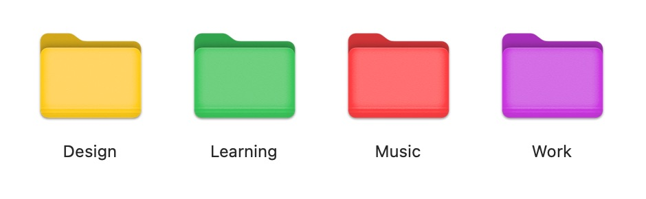
The choices are examples, not a rule. Keep names such as Design and Music: color should add a cue, not replace the label. This also helps when colors are difficult to distinguish.
Apply the first color
Open Moodsk and choose Yellow from Colors. Click Choose Files or Folders, select the Design folder, and choose it. Wait for completion, then check Finder.
Repeat with Green for Learning, Red for Music, and Purple for Work. We tested these four changes on empty local folders. The result shown above comes from Finder, not an illustration of the intended result.
The Colors collection is free for direct application. Using the editor to export or apply an edited design requires Editor Pro. Paid packs are separate purchases.
Keep the system small
Use the same colors for the same categories across projects. Leave rarely used folders with their default icons. Review the system after a week: if you need to remember what several colors mean, simplify it.
For a single folder, the native macOS customization options may be enough. Moodsk also provides an icon library and an editor when you want text or a design you can reuse. See the folder icon guide for both starting points.
Changing an icon does not sort or move the folder's files. Keep a clear folder structure and useful names. The icon is one more visual cue.